Find Advisor Brief:
The primary goal of this project was to enhance the user experience on the Find Advisor page, focusing on improving navigation and connectivity with financial advisors. We employed a data-driven approach, utilising insights from user feedback, workshops with stakeholders, and extensive user behaviour analysis. In addition, we employed user journey mapping to identify existing pain points and explore opportunities for improvement.
Summary Points from Research:
User Navigation – Streamlining Opportunities:
Identified the need to streamline user navigation through data analysis, focusing on location and name tabs.
The form’s low completion rate indicated a misalignment with user goals.
Form Optimisation – Enhancing User Experience:
Recognised the form’s design constraints and the need for improved accessibility and validation.
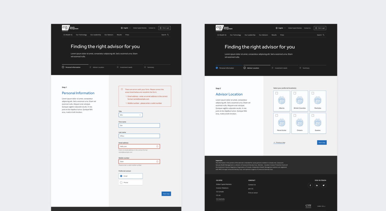
Proposed breaking the form into multiple steps to guide users effectively.
Location Selection – Improving UX:
Addressed issues with the location selection process, including a lack of clear indication after filtering and a disjointed page reload experience.
Advisor Cards – Optimising Space:
Noted the substantial grid space occupied by advisor bios, impacting user scrolling and visibility.
Proposed the removal of bios to optimise space and enhance the overall grid layout.
Points of Improvement Implemented
Reducing Cognitive Load:
Form divided into 4 steps with a progress bar for a smoother user experience.
Simplified layout based on user data, defaulting to location upon landing.
Prompts and Validations:
Introduced relevant prompts and validation messages to guide users through the form, ensuring accurate data collection.
More Engaging UX:
Enhanced field design and layout for a dynamic and engaging user experience, encouraging form completion.
Minimising Clicks:
Simplified layout to minimise clicks for primary user journeys such as location search, improving overall usability.
Improving UX with Signposting:
Merged provinces and regions into one dropdown, offering a clearer user experience with distinct filter indications.
Distinctive CTAs:
Separated the form into a distinct section with a clear call-to-action, simplifying & focusing user journeys with clear intent.
A Better Use of Space:
Improved advisor cards by removing bios, optimising grid space, and enhancing the mobile user experience.
Conclusion:
Utilising data-driven insights, user journey mapping, and an understanding of various user scenarios, we successfully revamped the Find Advisor page, addressing specific needs and pain points for different user groups. The implemented improvements aim to make the process more efficient, engaging, and aligned with Canaccord Genuity’s brand image, ultimately facilitating seamless connections between clients and financial advisors.
Upon launching the redesigned Find Advisor page, we aspire to see increased user engagement, evidenced by higher page views and user interactions. Positive feedback from user satisfaction surveys will affirm the success of the improved design and usability. Additionally, we anticipate improved conversion rates, specifically in users connecting with advisors, as a key indicator of the project’s success.


