Bridge the Gap Studios

Bridge the Gap Studios is a CIC that works with young people & families facing challenging life situations. We encourage and facilitate improvements – in home life, educational attainment, attitudes, and futures. We use music and drama therapy, a variety of creative workshops, and evidenced based parenting programs as platforms to illustrate and support positive life choices. In the last 5 years, we have supported over 200 young people and families across London.

The problem
Bridge the Gap Studios faces a crucial challenge in aligning their brand identity with the profound impact they have on transforming lives within families and rebuilding communities. The previous brand identity does not fully capture the essence of their mission and the positive impact they bring to individuals and communities. They required a new identity to authentically reflect the heart of Bridge the Gap Studios’ mission and highlight their commitment to positive change within families and communities. This rebranding effort will not only enhance their visual representation but also solidify their position as a catalyst for meaningful transformation.

Role
Design Lead

The outcome

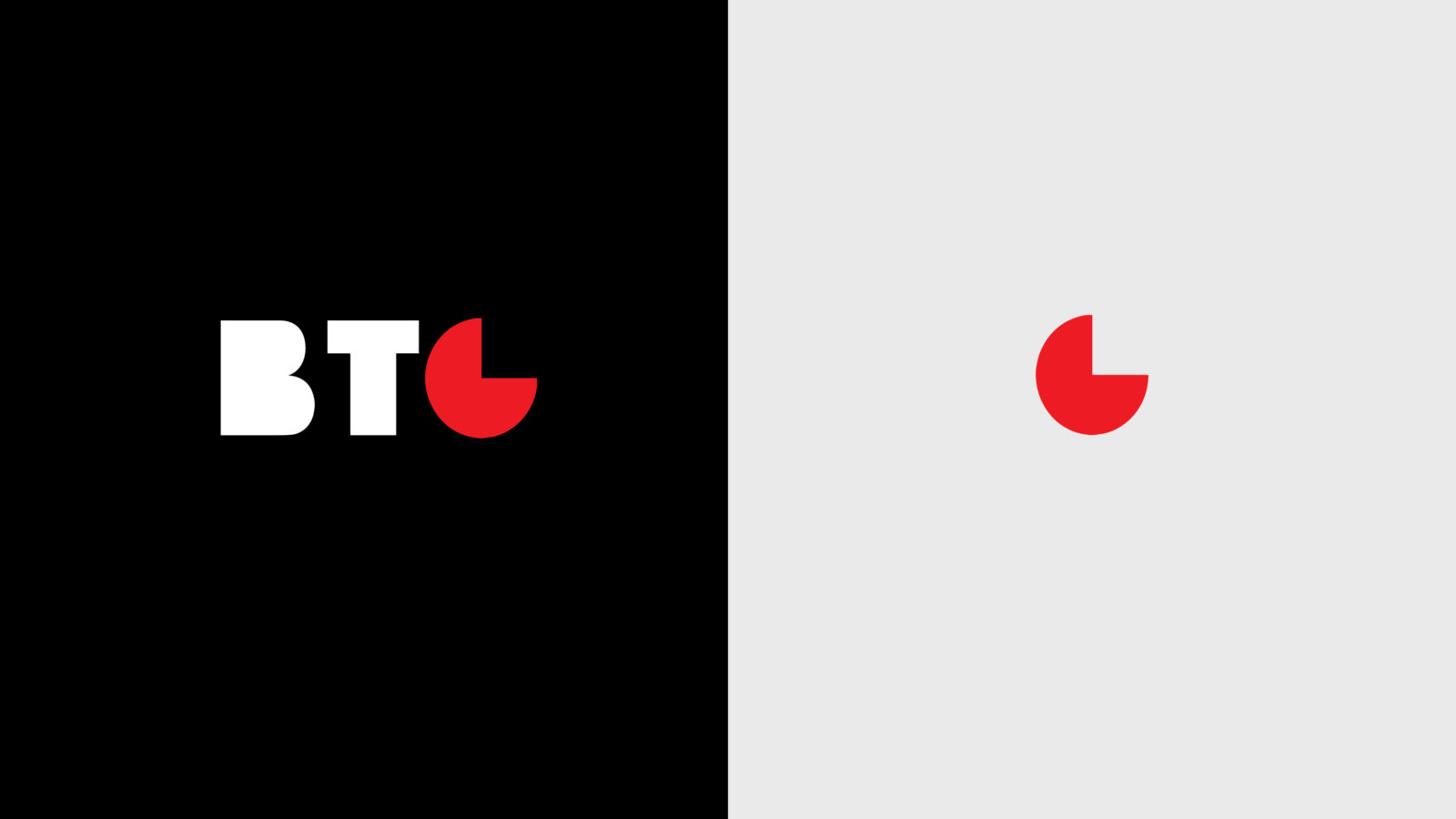
The newly crafted logo for Bridge the Gap Studios stands as an artistic representation of their mission to build families, cultivate communities, and empower emerging leaders. The carefully selected solid font not only exudes strength but also cleverly embodies the concept of construction. Notably, the letter “G” is ingeniously designed to emphasise the pivotal “gap” at the core of the brand’s purpose, symbolising unity and completeness when enclosed within a circle.

One significant achievement is the logo’s newfound adaptability. With multiple responsive states, it seamlessly adjusts to various formats, offering versatility in its application. Unlike before, the BTG or G symbol can now stand alone, amplifying the logo’s visual impact and providing flexibility in usage. The wordmark, now stackable in playful configurations, enhances the logo’s iconic presence, whether running vertically along the page edge or horizontally.

Addressing the colour palette, the strategic simplicity contributes to the logo’s purposeful impact. The refined colour choices not only convey a sense of clarity but also align seamlessly with Bridge the Gap Studios’ transformative mission. In summary, this reimagined brand identity successfully encapsulates the organisation’s values, making it more visually powerful, adaptable, and reflective of its profound commitment to positive change within families and communities.